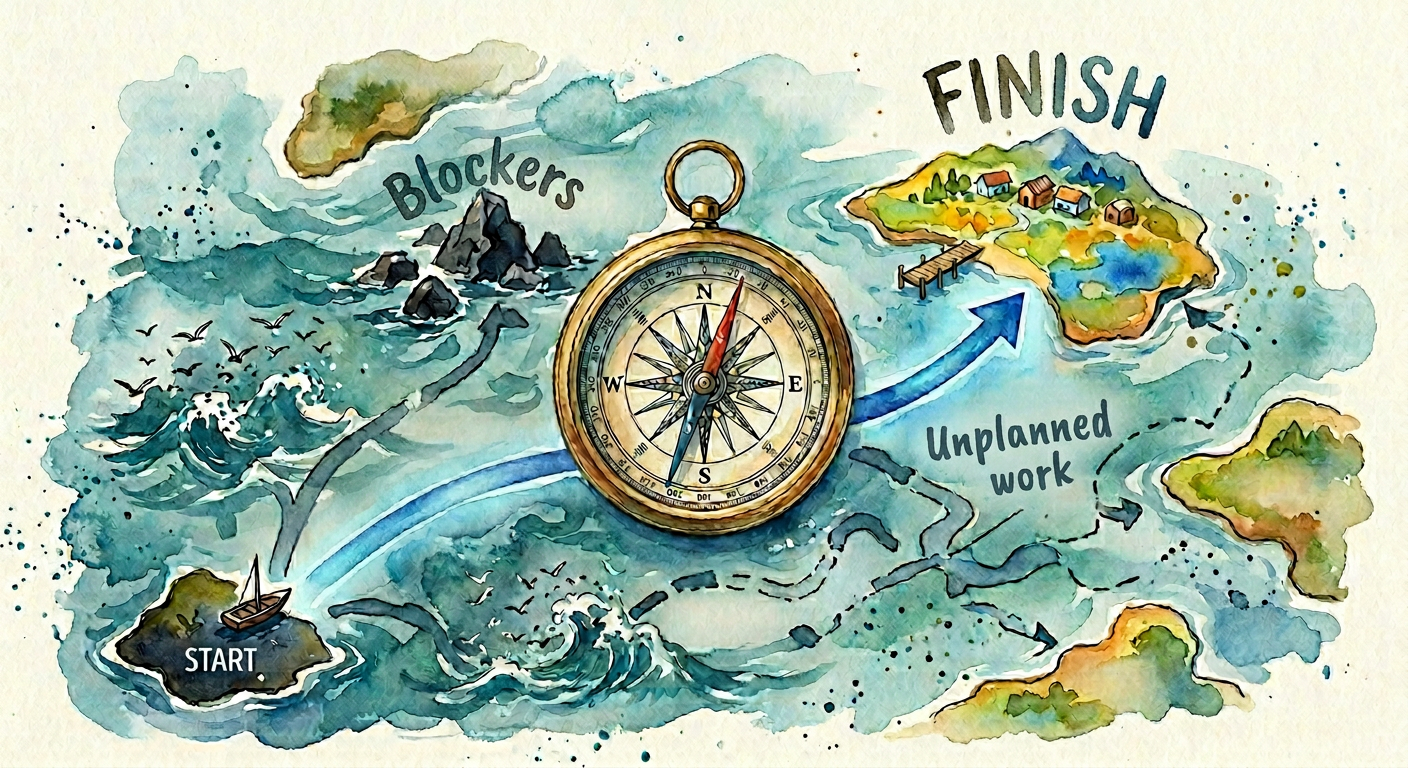
The Past Is the Best Forecast: How I Use Historical Data to Predict Engineering Delivery
A practical guide for Engineering Managers who want real predictability — not wishful thinking
There's a question I used to dread. It would come from a product manager, a stakeholder, or a VP in a planning meeting: "When will this be done?"
For a long time, my answer was a guess dressed up as a plan. We'd estimate in story points, velocity-average our way to a date, and then spend the next two months explaining why the date was wrong.
Then I changed my approach. I stopped asking the team to predict the future, and started letting the past speak for itself.
This article covers the exact tools and techniques I now use as an Engineering Manager to build real forecasting capability into my team.
Why Most Estimates Are Fiction
The standard approach to software estimation goes something like this: break the work into pieces, assign points to each piece, divide by average velocity, get a date. It feels rigorous. It almost never works.
The problem isn't laziness or incompetence — it's that we're treating estimation as a math problem when it's actually a statistics problem. A single estimate is a point. What we actually need is a distribution.
When I ask "how long will this take?", what I really mean is: given everything that could go wrong, everything we don't know yet, and everything we've learned from past projects — what's the realistic range of outcomes?
Historical data answers that question far better than any upfront estimate.
The Four Metrics That Actually Matter
Over time, I've narrowed my focus to four metrics. Each one tells a different story about your team's health and predictability.
1. Cycle Time
Cycle time measures how long a single work item takes from "in progress" to "done." It's the purest signal of your delivery system's performance.
I track cycle time per ticket type — bugs, features, and tech debt often have very different distributions. More importantly, I look at the percentiles, not the average. If my team's p50 cycle time is 3 days but p95 is 18 days, I have a tail-risk problem that an average completely hides.
How I use it: When someone asks how long a feature will take, I look at historical cycle times for similar-sized items and say: "Based on our last 6 months, 50% of items like this ship in under 4 days. There's a 15% chance it takes more than 2 weeks." That's an honest answer.
2. Throughput
Throughput is the number of items your team completes per week or sprint — nothing more. No points, no hours, no complexity weighting.
I switched from velocity (story points per sprint) to throughput (items per week) for one reason: story points introduce a subjective layer that pollutes the signal. Two different teams — or the same team six months apart — will size stories differently. Counting items completed is objective and comparable over time.
How I use it: I use a rolling 12-week throughput chart to see trends. Is the team speeding up? Slowing down? Holding steady? A downward trend before a major milestone is a much earlier warning than a missed sprint goal.
3. Work In Progress (WIP)
This one changed how I manage my team more than any other metric. WIP is simply the number of items currently in flight at any given time.
Little's Law tells us that cycle time = WIP ÷ throughput. That means if your WIP doubles, your cycle time doubles — all else being equal. High WIP is the silent killer of predictability. Work piles up, context-switching increases, items age in the queue, and suddenly everything is "almost done" and nothing is shipped.
How I use it: I set a WIP limit for the team — usually 1.5x the number of engineers — and I review it in every weekly sync. When WIP climbs above the limit, we stop starting and start finishing.
4. Flow Efficiency
Flow efficiency = active work time ÷ total elapsed time. It answers the question: of all the time a ticket was "in progress," what percentage was someone actually working on it?
Most teams, when they measure this for the first time, are shocked. A flow efficiency of 15–25% is common, meaning tickets spend 75–85% of their time waiting — in queues, in review, blocked, or simply forgotten.
How I use it: Low flow efficiency tells me where to intervene. If review wait time is the bottleneck, I address the review culture. If blocking issues dominate, I look at dependency management. The metric points me to the root cause rather than the symptom.
The Forecasting Technique I Actually Use: Monte Carlo Simulation
Once you have historical throughput data, you can stop estimating entirely and start simulating.
Here's the idea: take your backlog count (say, 40 items). Randomly sample from your historical weekly throughput (say, you've completed between 3 and 9 items/week over the past 12 weeks). Run that simulation 1,000 times. The result is a probability distribution of completion dates.
This sounds complex, but in practice it takes about 15 minutes with a spreadsheet or a simple script. And the output is far more honest than any Gantt chart: "Based on our historical pace, there's a 50% chance we finish by March 14, an 85% chance by April 2."
Stakeholders initially want a single date. I give them one — the 85th percentile — and explain that this is what I'd actually commit to. Over time, when those dates prove accurate, the trust builds itself.
Reading the Signals: Patterns I've Learned to Watch
Raw metrics are the foundation, but pattern recognition is what turns data into intuition.
The Velocity Cliff. Throughput holds steady for weeks, then drops 40% in a single sprint. This almost always precedes a team member leaving, a sudden architecture problem surfacing, or a major process disruption. Now I treat an unexplained velocity cliff as a signal to have a direct conversation — before it becomes a crisis.
The WIP Creep. WIP climbs slowly over 3–4 weeks without anyone noticing. By the time it's visible, the team is overloaded and morale is dropping. I now track WIP on a simple time-series chart and flag any two-week upward trend.
The Age Distribution Shift. I look at the age of open items weekly. When the percentage of items older than 2 weeks starts growing, scope is expanding faster than the team can absorb it. This is a planning problem, not an execution problem.
The Review Bottleneck Pattern. Flow efficiency drops while throughput holds steady. Items are moving quickly into review and then stalling. This is a culture cue — either reviews aren't being prioritized, or the team needs to discuss review norms.
Making It Stick: How I Share This With My Team
Data only drives change if the team owns it. Here's what works for me:
I keep a single shared dashboard — a Notion page or a simple spreadsheet — with four charts: cycle time distribution, weekly throughput, current WIP, and flow efficiency. It's updated every Monday morning, usually automatically.
In our weekly team sync, I spend five minutes on the data. Not to review performance, but to ask: "What does this tell us? What should we try differently this week?"
I also share forecasts openly with the team before I share them with stakeholders. The team should always know the honest picture first. This builds trust and ensures the data is grounded in reality, not just optimistic projections.
The Mindset Shift That Makes All of This Work
The deepest change in how I operate as an EM didn't come from any tool or metric. It came from accepting a simple truth: the future is uncertain, and pretending otherwise is a disservice to everyone.
Historical data doesn't eliminate uncertainty. It quantifies it. And quantified uncertainty — "there's a 20% chance we miss this date" — is something you can act on, communicate clearly, and manage proactively.
That's the real goal. Not perfect prediction. Honest, calibrated forecasting that lets your team, your stakeholders, and you make better decisions.
The past is imperfect. But it's the best signal we have.
If this resonated with you, I'd love to hear how your team approaches predictability. What metrics have you found most useful? What patterns do you watch for?